Beautiful but Broken: How Stunning Design Trends Are Silently Sabotaging UK Business Revenue
The design is gorgeous. The portfolio shots are Instagram-perfect. The client brief called for something "modern and cutting-edge." Yet three months after launch, the enquiry forms are gathering digital dust and conversion rates have plummeted. Sound familiar?
Across the UK, businesses are discovering a harsh truth: what wins design awards rarely wins customers. While agencies chase visual trends that photograph beautifully, real companies are bleeding revenue to interfaces that prioritise aesthetics over action.
The Ghost Button Epidemic
Walk into any trendy coffee shop in Manchester or Brighton, and you'll spot them immediately on the screens around you: ghost buttons. These transparent, outline-only calls-to-action have become the design equivalent of skinny jeans – ubiquitous, fashionable, and surprisingly impractical.
"Ghost buttons look sophisticated, but they're conversion killers," explains Sarah Chen, UX strategist at a Birmingham-based consultancy. "We tested them against solid buttons for a Leicester manufacturing client. The ghost version generated 34% fewer enquiries over six weeks."
The psychology is straightforward. Ghost buttons blend into backgrounds, requiring users to hunt for clickable elements. In an economy where attention spans are measured in milliseconds, invisible calls-to-action are business suicide.
Yet they persist across UK business websites, from Yorkshire law firms to Cornwall surf schools, because they photograph well in case studies and satisfy clients who equate minimal with modern.
Parallax Overload: When Movement Becomes Motion Sickness
Parallax scrolling – where background images move slower than foreground content – once felt revolutionary. Today, it's the web design equivalent of a spinning bow tie: attention-grabbing for all the wrong reasons.
A recent study tracking user behaviour across 200 UK small business websites revealed that pages with heavy parallax effects saw 28% higher bounce rates and 40% lower task completion rates. Users literally couldn't find what they needed through the visual noise.
"We redesigned a Nottingham restaurant's website last year," recalls James Morrison, creative director at a Midlands agency. "The original had this elaborate parallax hero section with floating ingredients and scrolling text. Beautiful stuff. But bookings were down 15% year-on-year."
The solution? A simple, static hero image with clear navigation and prominent reservation buttons. Bookings increased 42% within two months.
The Full-Screen Video Trap
Nothing screams "premium brand" like an auto-playing video header consuming the entire viewport. Nothing says "slow loading times and confused users" quite like it either.
Full-screen video backgrounds have become the digital equivalent of those aggressive perfume sprayers at department store entrances – overwhelming, resource-intensive, and likely to drive people away before they've properly arrived.
Mobile users, who represent over 60% of UK web traffic, are particularly punished. Large video files drain data allowances and battery life while obscuring actual content behind decorative motion.
"A Devon tourism company came to us after their bounce rate hit 70%," says Emma Richardson, performance specialist at a Plymouth agency. "Their homepage video was 12MB and took 8 seconds to load on 3G. Visitors were leaving before seeing a single attraction."
The Instagram Influence Problem
Social media has warped our perception of effective design. Instagram and Behance celebrate visual impact over practical results, creating an echo chamber where designers optimise for likes rather than leads.
This disconnect is particularly damaging for UK SMEs, who often lack the budget for extensive user testing. They're sold on concepts that look stunning in mockups but fail spectacularly in real-world usage.
"Clients show us inspiration from design blogs and expect the same aesthetic," admits a London-based creative director who requested anonymity. "But those portfolio pieces are often concept work or heavily styled screenshots. They're not optimised for actual business goals."
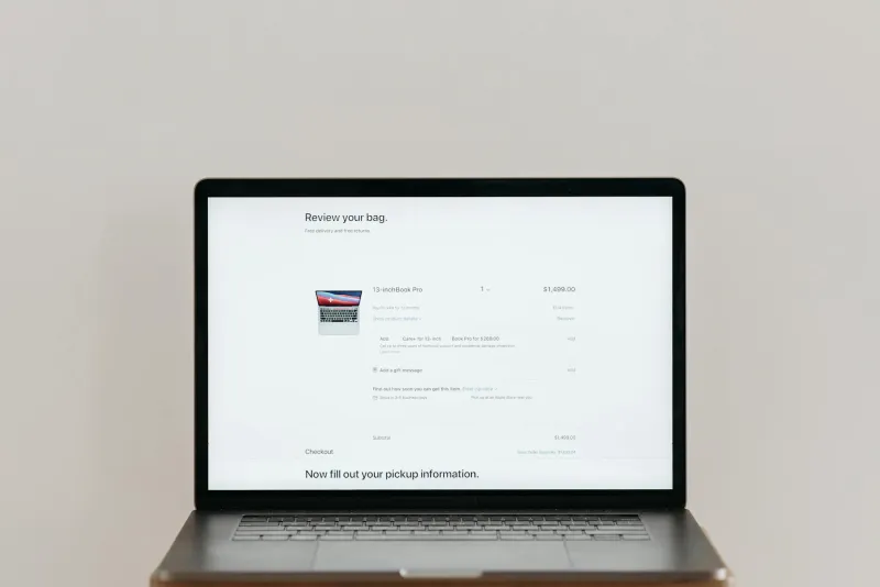
The Conversion Reality Check
Real conversion optimisation is decidedly unglamorous. It involves testing button colours, adjusting form lengths, and refining copy – iterative improvements that rarely make design blogs but dramatically impact bottom lines.
A Manchester e-commerce client increased checkout completions by 23% simply by removing a trendy progress indicator that confused mobile users. A Bristol consultancy boosted enquiries 18% by replacing their minimalist contact form with a more detailed but trustworthy version.
These wins don't photograph well, but they pay the bills.
Beyond the Portfolio Shot
The most successful UK digital agencies are quietly abandoning trend-chasing for data-driven design. They're measuring success in conversions, not competitions.
"We stopped entering design awards five years ago," explains the founder of a thriving Yorkshire agency. "Our clients don't care if we win trophies. They care if their phones ring."
This shift requires difficult conversations with clients seduced by flashy trends. But businesses investing in conversion-focused design are seeing measurable returns while their trend-following competitors struggle with beautiful but barren websites.
The Path Forward
Effective web design in 2024 isn't about avoiding trends entirely – it's about understanding when aesthetics serve business goals versus when they sabotage them.
Ghost buttons work for secondary actions but fail as primary calls-to-action. Parallax effects can enhance storytelling but shouldn't impede navigation. Video backgrounds create atmosphere but must load quickly and include fallback images.
The UK businesses thriving online have learned to ask better questions: Does this design element help users complete their goals? Will it work on a cracked phone screen in poor lighting? Does it load quickly on rural broadband?
These aren't sexy questions, but they're profitable ones. In a market where every click counts, beautiful but broken design is a luxury no business can afford.
The most stunning website in your portfolio means nothing if it's not generating results for the business paying for it. Perhaps it's time UK designers started optimising for outcomes rather than awards.